BioBM's Life Science Marketing Blog
Browse by topic
Showing 1–24 of 255

The Importance of Conversion Tracking in Life Science Marketing
In life science marketing, success isn’t just about driving website traffic or racking up clicks – it’s about generating real business outcomes. If you want to know whether your campaigns are doing the job, you need to track what actually matters: the actions people take that move them closer to becoming customers.
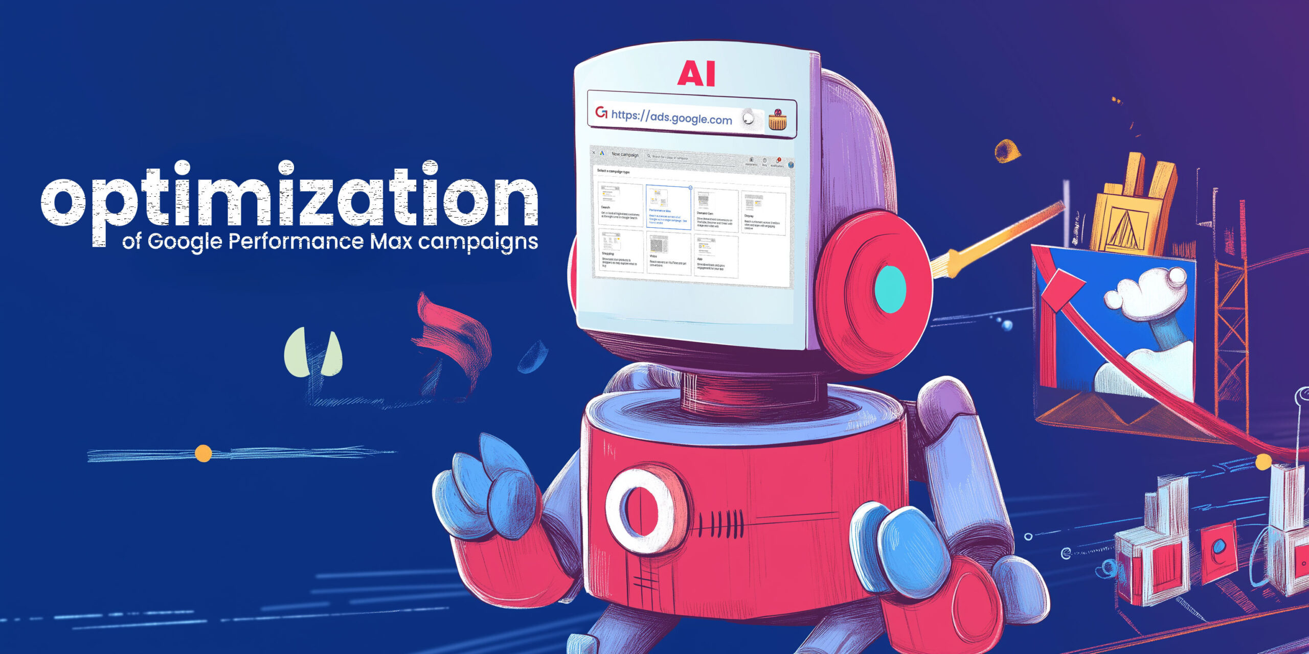
Google Performance Max Campaigns Make Revenue Attribution Critical for Life Science Marketers
Google Ads AI is smart, but it's your job to ensure it has the data it needs. Performance Max (also known as PMax) a newer Google Ads campaign type which heavily leverages AI to achieve specific goals, such as sales, leads, or phone calls.
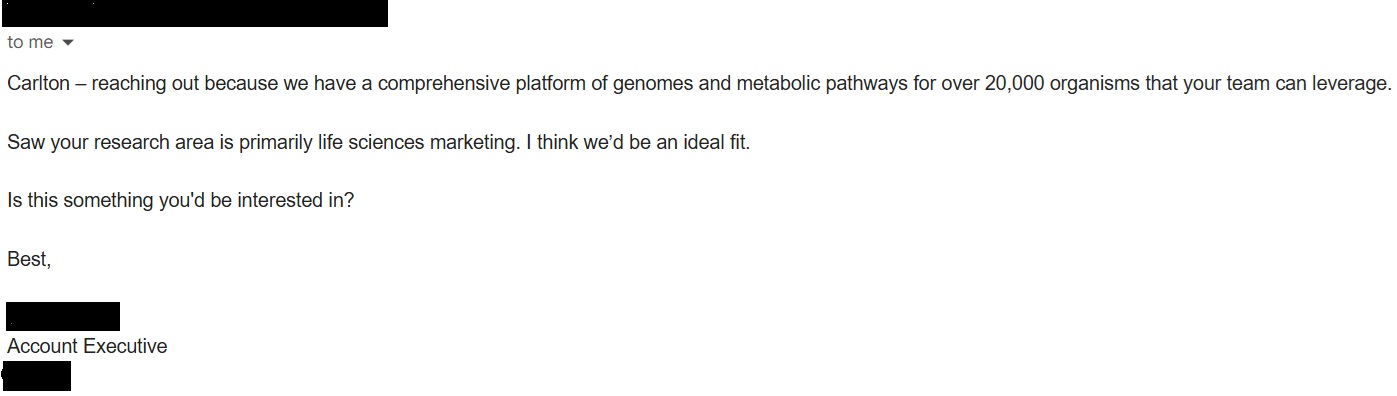
Scientists Hate AI Spam as Much as Old School Bulk Spam
I've been getting AI generated spam for well over a year. It was immediately clear to me when it started. My spam emails became slightly more personalized than regular spam. They were all short: usually 2-4 sentences.
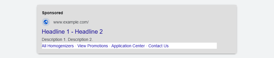
Supercharge Your Google Ads With Every Possible Extension
Life science companies constantly face numerous challenges in capturing their audience’s attention on crowded search engine result pages (SERPs) with Google Ads. To make their ads stand out and attract their scientific audiences it is essential to present key information in a clear and engaging way.
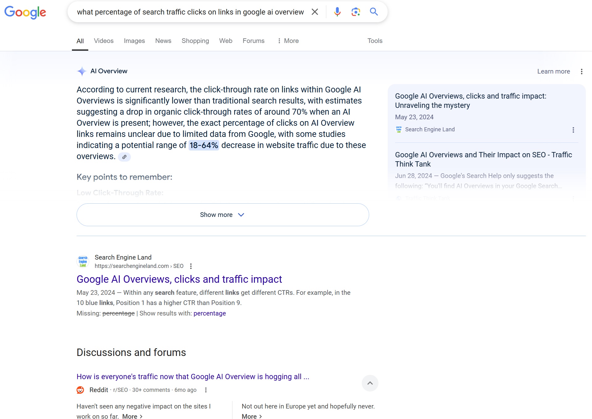
What is Generative Engine Optimization and can life science marketers make use of it?
Everyone knows what search engine optimization (SEO) is, and many companies take great efforts to ensure they show up near the top of organic search results and benefit from the resulting traffic which comes at no unit cost.
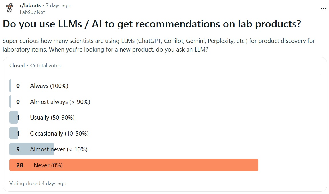
Do Scientists Use AI / LLMs for Product Discovery?
There has been a lot of talk about AI optimization in the marketing world, much of which was spurred by the release of a preprint article published to arXiv (pdf) in September which demonstrated that LLMs could be manipulated to increase product visibility.

Can Perplexity Reliably Answer Technical Questions in the Life Sciences?
The generative text AI tool Perplexity has rapidly gained popularity in the life sciences for its ability to show its references when answering. As those references can include scholarly articles, it has great potential as a literature review assistant for scientists.

Don’t Stress About “Nofollow” Backlinks
As the name implies, a link relationship tag provides context to search engines and other automated crawlers on the nature of the relationship between the source page and the destination page.
AI-based Language Models: the End of Life Sciences Copywriters?
On November 30th, 2022, the world witnessed a technological revolution that would forever alter the landscape of content generation and communication. It was a day that will be remembered as the birth of a digital entity that came to be known as "Chat Generative Pre-Trained Transformer," or simply ChatGPT.
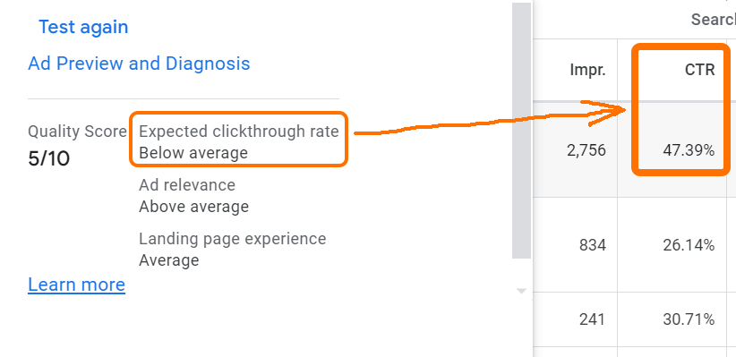
Don’t Optimize for Quality Score in Google Ads
Sometimes you just have to let Google be Google. Large, complex algorithms which pump out high volumes of decisions based in part on non-quantifiable inputs are almost inherently going to get things wrong sometimes.
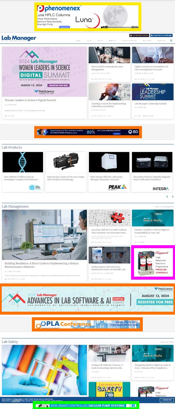
Avoid CPM Run of Site Ads
We don't think about run of site (ROS) ads frequently as we don't often use them. We try to be very intentional with our targeting. However, we recently had an engagement where we were asked to design ads for a display campaign on a popular industry website.
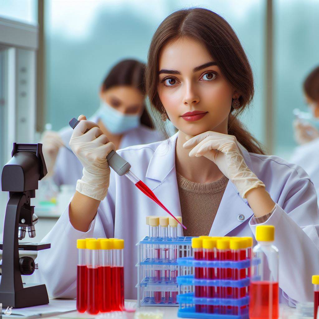
Can DALL-E 3 Generate Passable Life Science Images?
For those uninitiated to our blog, a few months ago I ran a fairly extensive, structured experiment to compare DALL-E 2, Midjourney 5, and Stable Diffusion 2 to see if any of them could potentially replace generic life science stock imagery.
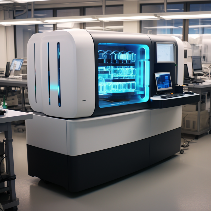
Can AI Replace Life Science / Laboratory Stock Images?
We're over half a year into the age of AI, and its abilities and limitations for both text and image generation are fairly well-known. However, the available AI platforms have had a number of improvements over the past months, and have become markedly better.
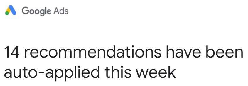
Google Ads Auto-Applied Recommendations Are Terrible
Google Ads has been rapidly expanding their use of auto-applied recommendations recently, to the point where it briefly became my least favorite thing until I turned almost all auto-apply recommendations off for all the Google Ads accounts which we manage.

How to Write a Life Science White Paper
From the perspective of the marketer, a critical early task in the life science buying journey is education. It may even come before your audience of scientists recognizes they have a problem which needs a product or service to solve it.
Stop Hosting Your Own Videos
I know this isn't going to apply to 90% of you, and to anyone who is thinking "of course – why would anyone do that?" – I apologize for taking your time. Those people who see this as obvious can stop reading.
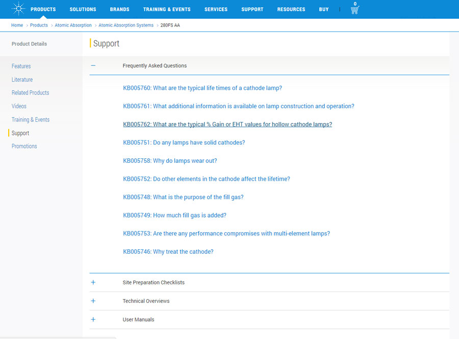
FAQs: Content and SEO’s Low-Hanging Fruit
Creating content in support of your products and services is hard. Finding something to say which is both unique and valuable to the audience is a non-trivial endeavor.

We Just Got Skyscrapered
Just yesterday, we got skyscrapered. No, we didn't get an office in a giant building or fly an ad from one or anything like that, nor is that some weird pop-culture thing that teenagers are putting on YouTube.
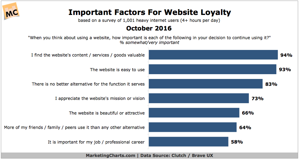
Why People Are Loyal … to ANYTHING
I was reading the MarketingCharts newsletter today and saw a headline: "What Brings Website Visitors Back for More?" The data was based on a survey of 1000 people, and they found the top 4 reasons were.

Are You Providing Self-Service Journeys?
Customers are owning more of their own decisions. We've all heard the data on how customers are delaying contact with salespeople and owning more of their own decision journeys.

Carlton Hoyt Discusses Decision Engines on Life Science Marketing Radio
Principal Consultant Carlton Hoyt recently sat down with Chris Conner for the Life Science Marketing Radio podcast to talk about decision engines, how they are transforming purchasing decisions, and what the implications are for life science marketers. The recording and transcript are below.
What Google RankBrain Means for SEO
There's been a ton of buzz in SEO circles about Google's new RankBrain algorithm. This is very understandable for two reasons. First, it's a nerd's dream. It's an artificial intelligence-based algorithm, and anything with AI in it is buzzy and awesome.

Lessons from Scientific Publishing’s Fight to Survive
First it was open access, then pure and simple pirating (Sci-Hub), and now preprints, as this recent New York Times article outlines. The business model of the major scientific publishers is under attack. This probably doesn't come as a surprise to many of us.

Personalization Can Backfire
Marketers are used to seeing a lot of data showing that improving personalization leads to improved demand generation. The more you tailor your message to the customer, the more relevant that message will be and the more likely the customer will choose your solution. Sounds reasonable, right?
Get the latest Life Science Marketing Insights directly in your inbox
Occasional articles, reports, and practical ideas from BioBM — no spam, unsubscribe anytime. We’ll email a confirmation link before you’re added to the list.